The Problem
- Fragmented Navigation
- High Interaction Cost
- Lack of Visual Previews
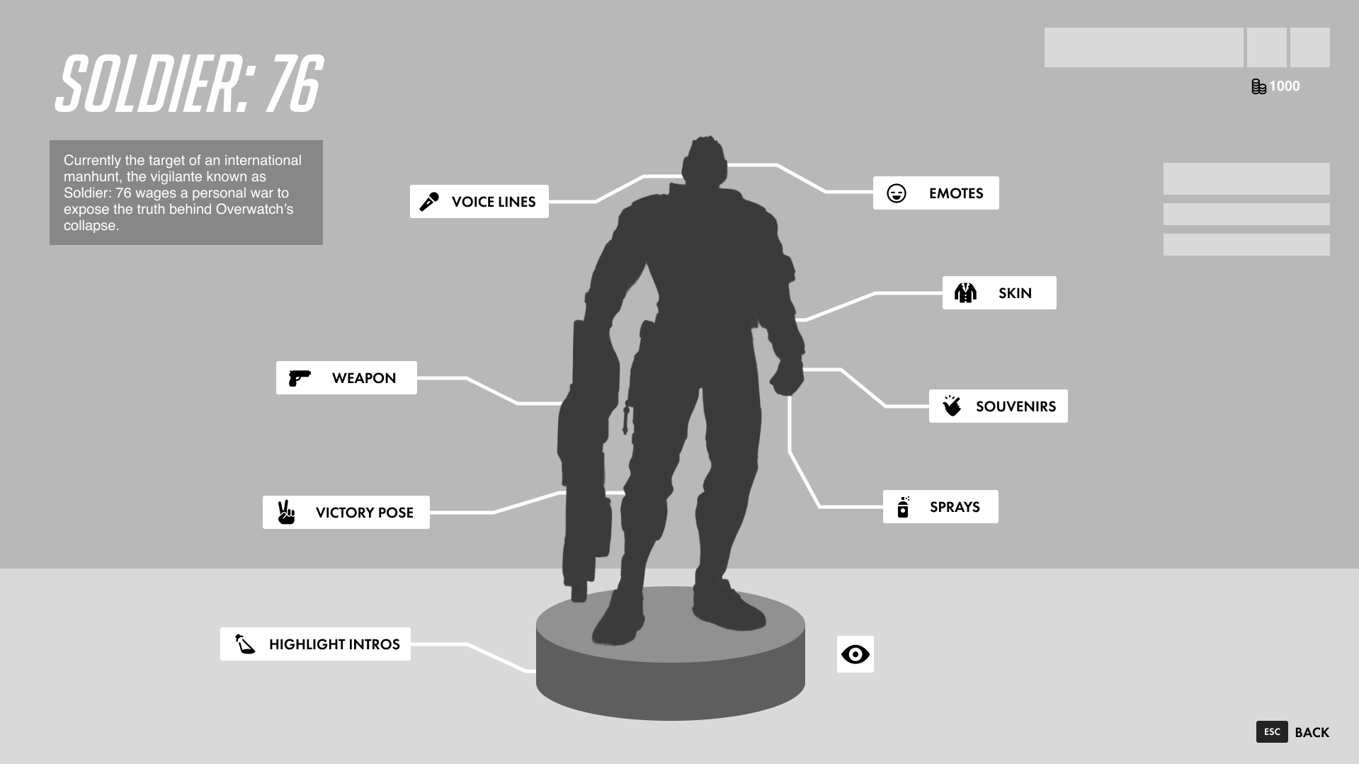
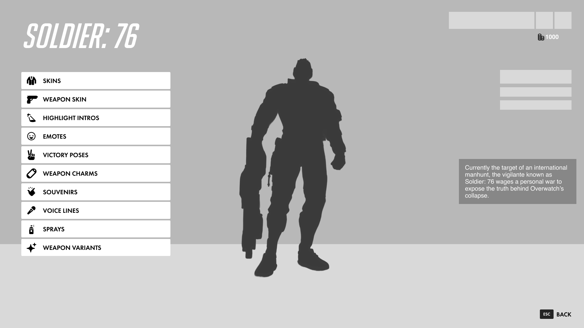
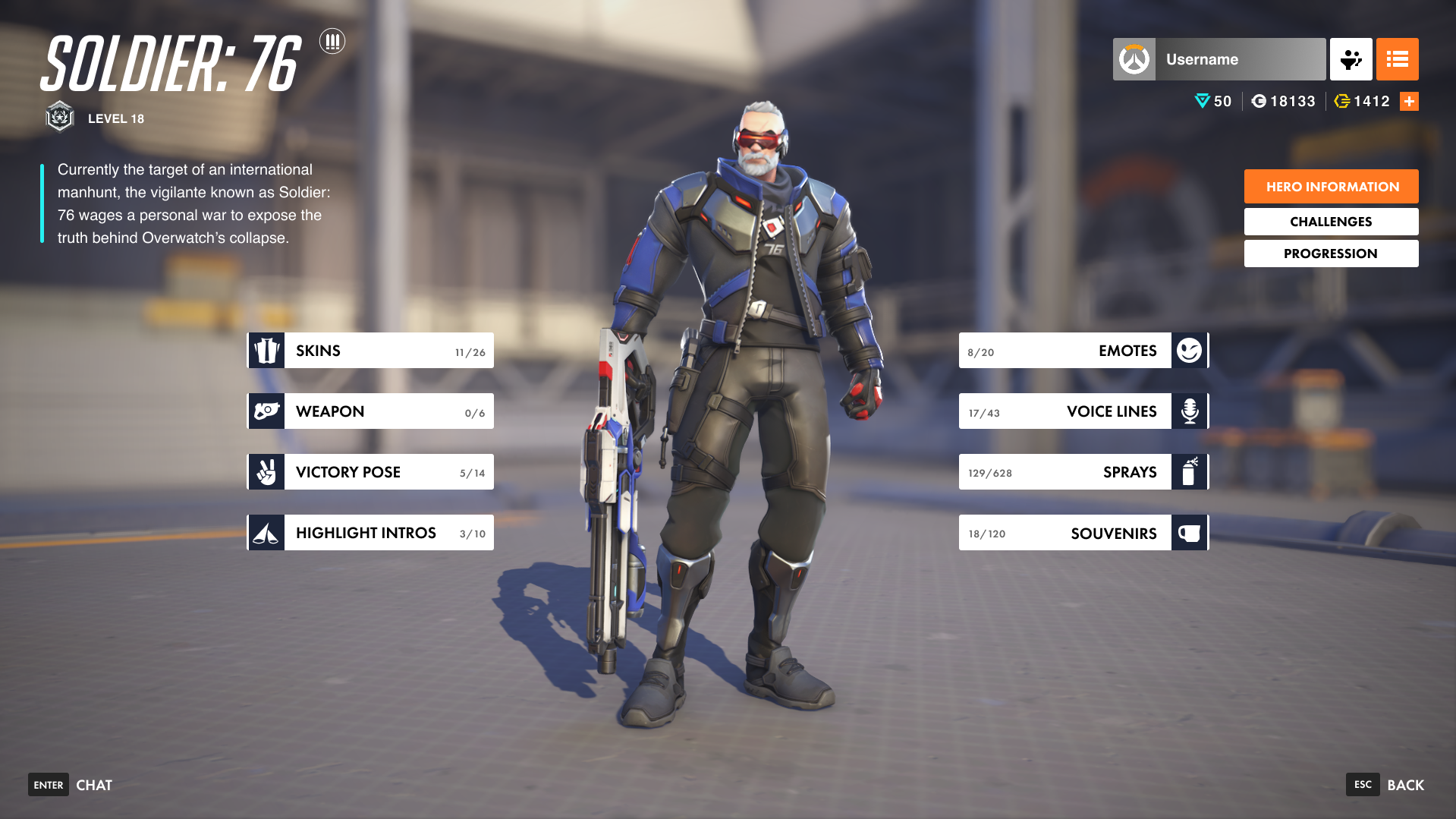
The current Overwatch 2 Hero Gallery suffers from fragmented information architecture, specifically regarding weapon customization. Features such as Golden Weapons, Weapon Skins, and Charms are siloed into separate top-level categories, forcing users to navigate through redundant menus to complete a single "set." This increases interaction cost and obscures the relationship between related cosmetic items.
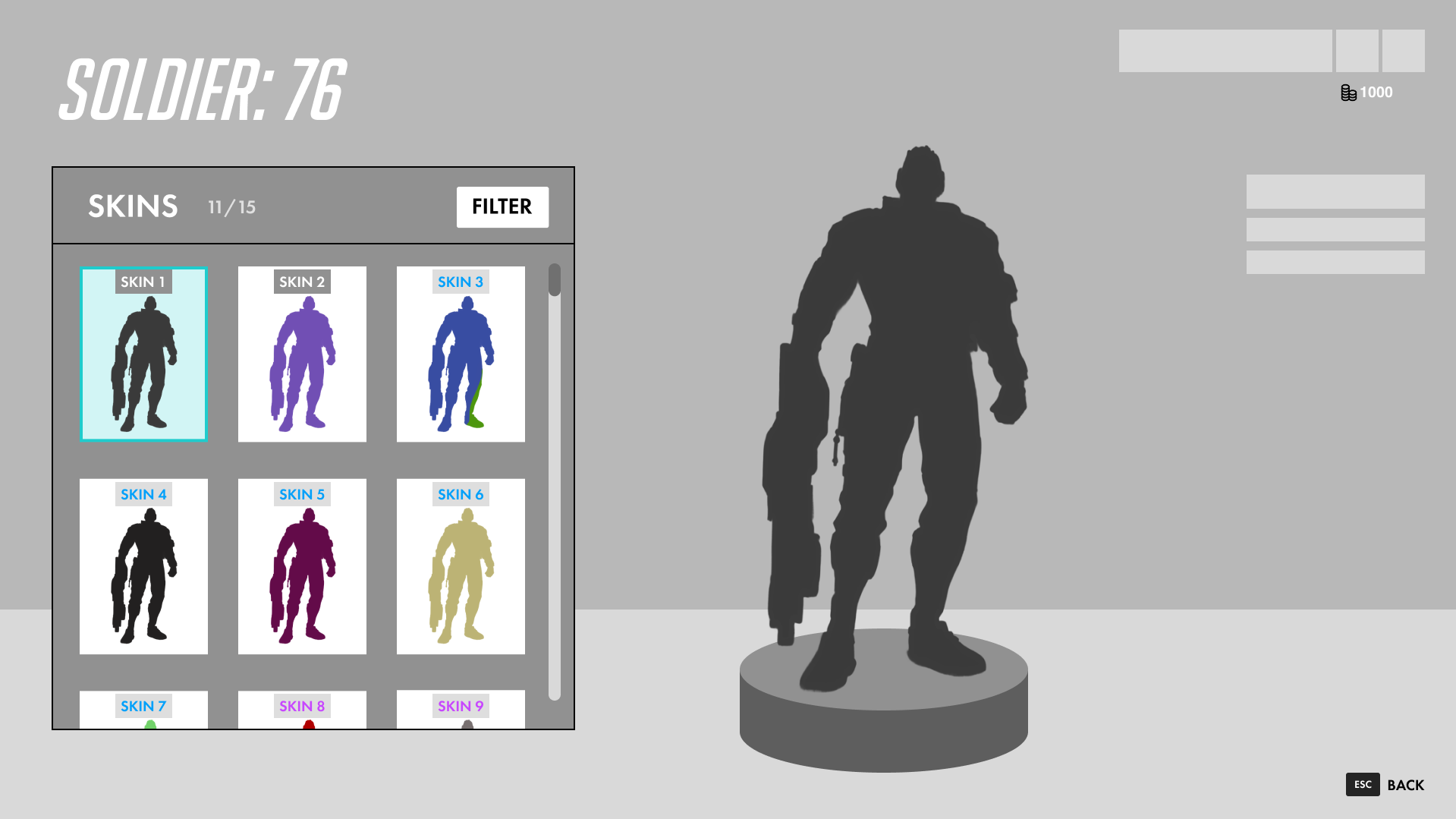
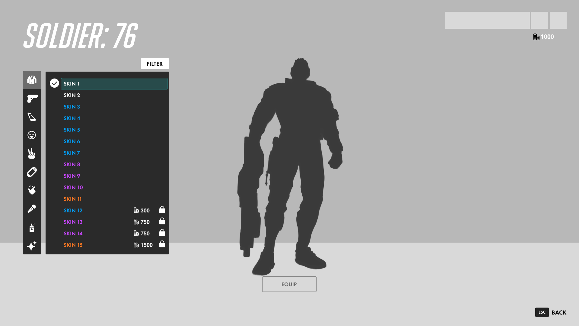
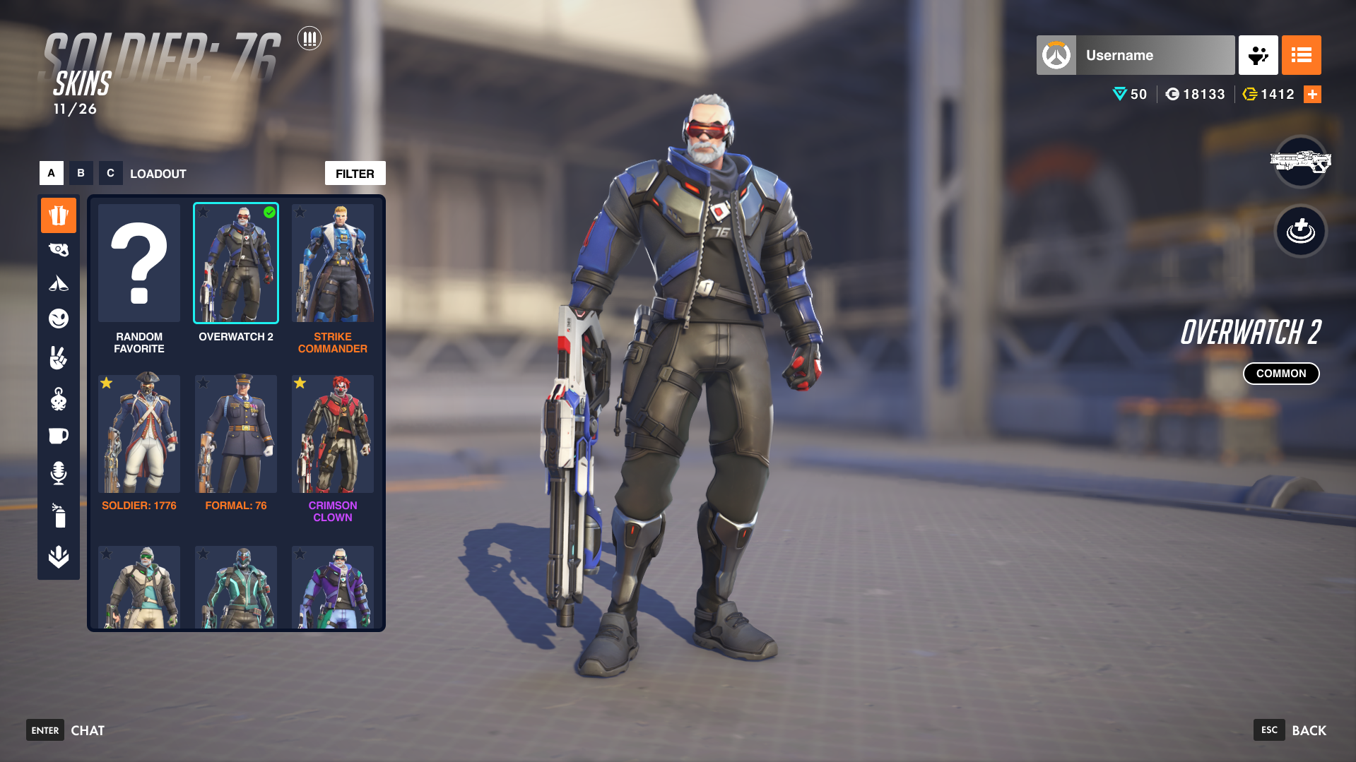
Furthermore, the skin selection process relies on text-heavy list views that lack visual feedback. By requiring users to click individual names to see a 3D preview, the interface creates a "trial and error" workflow. This lacks the scannability found in modern gaming interfaces, where visual grids are the industry standard for rapid comparison and decision-making.
The Process
01. Exploratory Ideation & Brainstorming
Using wireframing as a brainstorming method, alongside research of the current UI.
02. User Testing & Research
Validating assumptions and investigating areas for improvement in my designs.
03. Iterative Wireframing
Using research insights, iterate on the wireframes to refine the look and feel of the screens.
04. UI Mockups
Make the transition between wireframes and a polished UI, while honoring the iconic Overwatch visual feel.
Exploratory Ideation & Brainstorming
I began by mapping out the current user flow and identifying "friction points" where navigation felt stalled. I brainstormed ways to make the cosmetic category navigation more seamless while upholding the traditional Overwatch design feel. Alongside my redesign wireframe, I recreated the current Overwatch UI in a matching wireframe style. The wireframes were multi-screened and semi functional for testing purposes.
User Testing and Research
To validate my assumptions, I conducted six user tests. I compared the existing text-based list against a visual grid by having users complete a series of tasks on both wireframe flows, followed by a few questions. The results validated my claims that the current UI restricts efficiency in ways that my design promotes it. The testing also showed me parts of the current UI that I should keep in my designs moving forward.
Iterative Wireframing
Based on research insights, I developed multiple wireframe iterations. I shifted from a list-heavy sidebar to a visual grid system. This phase focused on refining my previous designs to ensure that while I was increasing information density, I wasn't sacrificing the "breathability" and clean aesthetic typical of Blizzard’s UI. Using my test data, I aimed to keep familiar anchors like the hero preview and top-level navigation, while completely overhauling the skin selection screen to reduce the "click-depth" required to find and equip a desired cosmetic.
UI Mockups
Once I was happy with how my screens looked, the final step was translating wireframe logic into the polished Overwatch 2 visual language. I recreated all of the in-game elements that I was keeping in my redesign including the titles, username and profile picture, currency indicators, etc. The only elements not made by me in Figma were the character designs and background image.
The Solution
Consolidated Information Architecture
The redesign introduces a unified "Weapon" category, merging previously redundant tabs (Weapon Skins, Charms, and Variants) into a single entry point. By increasing the spacing between categorical buttons, the UI reduces visual noise, allowing players to focus on one customization "pillar" at a time. This reorganization respects the player's mental model of a unified hero loadout.
Visual-First Discovery Grid
The core of the redesign is the transition from a text-heavy list to a High-Density Visual Grid.
- Eliminating "Hidden" Data: Players no longer need to click through a list of names to find a specific look; the visual artifacts are front-and-center.
- Preserving Familiar Anchors: To ensure a seamless transition for veteran players, established signifiers, such as rarity color-coding, "Equipped" checkmarks, and the "Favorite" star system, remain consistent with the original game’s visual language.